Psychological Factors Behind Great Web Design
Web design gives an overall viewpoint of a business and therefore plays a deciding factor in converting sales. It is evident by the fact that it takes a visitor only 50 milliseconds to decide whether a website is worth their time or not. About 57% of mobile users say they won’t consider shopping from an online brand that doesn’t have an attractive design.
Deploying the best web design practices is crucial if you need to make a mark amongst your competitors. While understanding different web design practices is one of the most important things to consider for many, not everyone dives into the details of how these practices are linked to human psychology.
Experts in developing an attractive user interface for a company website know that web designing goes beyond making an eye-capturing site. A quality web design company should be offering expertise that goes into design psychology – those design elements will subconsciously engage the mind and attract site visitors.
Psychology and Design
The rise of online marketing and eCommerce has made it difficult for businesses worldwide to gain their clients’ attention and target the market. This is why web design work has become personalized and subjective based on how a target audience behaves. Knowing the psychology of web design helps to increase a website’s click-through rates and rankings.
– By applying design psychology, a web designer can produce significantly positive results. Web design psychology helps greatly in persuading the users to take considerable actions a company has anticipated.
– It helps visitors link a company identity to the repeatedly used components such as fonts, colors, and other conceptual elements, improving a business’s credibility.

Elements Influencing the Human Psyche
Some of the best elements in the user interface arena to influence the human psyche include the following:
Color
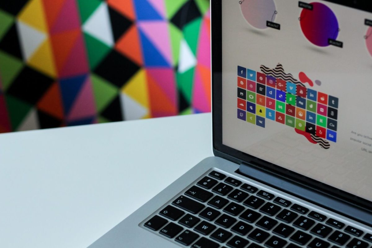
Color has a tremendous psychological influence by triggering a prospect’s emotional reaction towards a certain thing. For instance, the color blue is used for promoting trust and calmness, while the color green is linked to nature and money. The black color hints to luxury, and the yellow hues are used for bringing excitement, a good reason why the color yellow looks good on a CTA (Call-To-Action) button.
On practical grounds, color relates to the following examples:
– The colors blue and green can be used in the background to make lengthy blog content look relatively easier to read.
– The color white in the space might give a sense of neutrality and break the theme color code to bring attention.
– A red or black and white theme can be applied to important buttons like CTAs to draw attention.
Typefaces
Different typefaces hint to different feelings and associations – for instance, the New York Times’ masthead written in Old English font depicts authority and trust. On the other hand, Sans serif hints at modernism, and the Comic sans version depicts fun and lightheadedness. You can apply this psychology of fonts according to your business’s nature and see what font fits the best according to the user interface.
The size and the format also matters. Known as typography, these elements help achieve defined customer goals. For example, the thin, narrow text hints at sophistication, while bold and wide texts create a newsflash vibe. Some one-word messages might be written vertically or in italics to create an impact.
Space
A crowded webpage looks disoriented and chaotic and is a big turn-off for many site visitors. On the other hand, one having little content or, in some cases, uncomplimentary design elements will feel insubstantial. Therefore, it is vital to get the right balance of design elements and content that appeals to the prospects, which in turn will generate positive feelings from the visitors.
For example, white space can create impact and/or is used to break the pattern and bring attention to the surrounding content. Blank space around a product on the landing page is often used to create impact.
Guiding Viewers
A smart web design company designs web pages for guiding a reader’s eyes, ultimately leading visitors to the design element you want them to see, which can be a link or a CTA button, for example.
A simple yet clever web design makes the visitors follow what you want them to while navigating through a website quickly.
Patterns
Magazine and newspaper publishers know that people tend to read pages through scanning in a “Z” pattern. It means the most critical elements of a website need to be at the upper left, mid-portion, and the bottom right of the page. It is the way humans are wired to read naturally, so the company website in the development process needs to have those patterns.

Psychology-Based Design Tips
Some of the psychology-based design tips that will help companies build better web designs to attract visitors are the following:
Stay Focused and Limited, That’s Hick’s Law
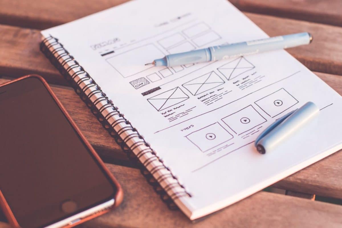
According to Hick’s Law, the more choices one has, the more time it requires to make a decision. So, the general rule of thumb in creating a good web design is to stay simple with design work and layout.
When a consumer gets bombarded with an overflow of information, it wastes their time and energy to choose a specific option, ultimately repelling your targeted audience.
For example, instead of going for multiple CTAs on a web page, creating a few positioned at the right spots will better grab the audience’s attention. Having a set color scheme also relates to this concept. Have a limited number of colors by creating a theme and apply certain colors to actionable links and buttons so your audience knows how to engage with your company website.
Apply the Mere Exposure Theory
The Mere Exposure effect states that seeing things frequently creates a sense of familiarity, which attracts viewers towards that thing.
User interface designers set the CTAs at such positions that are often habitual for the average internet user to look at. These can be positions where the users can navigate their cursors involuntarily. For instance, web designers often place the “next” cursor on the sites’ top right side as they know the users will search for buttons like “home” there. It is the reason you see a lot of CTAs like the notification icons and user profile on this top right corner.
Don’t Forget A/B Testing
A/B testing is essential for figuring out which design element works the best for your site. Do this often and when there is confusion about extracting the results, test the site having two versions for checking which one gets a better response.

Psychology Of Design Is A Must For Attractive Website
Design and psychology go side by side and are something all companies need to acknowledge and incorporate in the website layout. Considering the psychology of web design can be the single largest factor in determining how perfect the designs are. It will help a business make necessary changes to increase the value of the site.
It does not take a lot of time, nor is it difficult. So, putting even some of the essential web design elements into the company website can extract many positive results for the business.
About The Author
Bogdan Bologa is a graphic designer in Mejix.


