Ecommerce Landing Pages – Why Are They So Important?
Landing pages are critical to every ecommerce company’s success, but what exactly are they? And why are they important?
In ecommerce, physical streets and stores are replaced with website pages. Instead of window shopping or browsing the racks, customers explore website pages to shop and get a better sense of companies and their offerings.
While homepages, contact pages, about pages, and product pages certainly do a lot for customers, you can’t overlook the importance of landing pages.
What is a Landing Page?
Before we can get into why landing pages are important, we need to answer the most basic question. What is a landing page?
Landing pages are standalone web pages designed to generate leads and convert potential customers. Essentially, landing pages are digital storefronts that attract visitors’ attention and encourage them to stay on your site and shop with you.
All the ad campaigns and mailing lists in the world won’t result in conversions if your landing page isn’t up to snuff. After all, when a customer clicks on a link in an advertisement or an email campaign, it will take them to a landing page. If they don’t like what they see, or the page doesn’t have a clear value proposition, they’ll likely leave without taking further action.
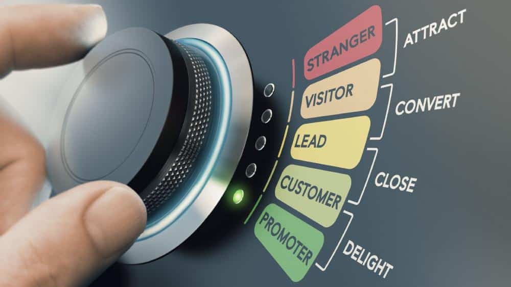
Unlike your homepage, which serves as a general cover letter for your business and discusses the basics, landing pages have a specific goal and should be created for a certain audience. However, not all landing pages are the same. You’ll need to personalize landing pages to your visitors’ needs and their progression in the sales funnel, as a landing page that works for a first-time visitor will look very different from one for a returning customer.
There are actually four different types of landing pages, including:
- Top-of-funnel landing pages: These landing pages are for new visitors who are unaware of your business. Since your top-of-funnel landing pages will be your first impression, you must make them count. To establish credibility, you may want to include your brand story and mission, the solutions your products or services provide, and reviews from existing customers.
- Mid-funnel landing page: The mid-funnel landing page is meant for those who are interested in your site but haven’t become customers. Instead of repeating information about the basics of your brand and products or services, a mid-funnel landing page should include content about a specific product, such as reviews or a limited-time discount. You’ll also want to include a CTA that encourages a purchase, such as a Buy Now or Add To Cart button.
- Bottom-funnel landing page: Designed for customers who have already visited your ecommerce website and added items to their cart yet have not bought anything, bottom-funnel landing pages. You might include a cart discount, bulk offers, bundle offers, free shipping, or a Frequently Bought Together section to encourage a sale, as these customers already have a buying mindset.
- Customer retention landing page: Designed to ensure your existing customers return to your site, the customer retention landing page is about building strong relationships. Since visitors are already familiar with your company, you can include customer loyalty incentives, early access to sales, exclusive deals, or sneak previews of new products to make customers feel special.

What is the Role of a Landing Page?
Landing pages have a couple of main goals.
First, they need to invite visitors to take action, whether that means making a purchase, subscribing to a newsletter, downloading a whitepaper, or filling out a survey. Landing pages should also create a strong impression on first-time visitors, help boost retention, and improve conversions. The most common goal of a landing page is to convert a visitor as soon as possible, whether they arrived from a search engine advertising (SEA) campaign or a mailing list.
It’s important to note that the role of a landing page differs from that of a product page. While product pages are designed to inform visitors about a business’ offerings and attract new visitors with optimized SEO, landing pages are designed with conversion goals in mind. They have one clear CTA, lack other pathways, and have been designed with one goal and for a specific audience. So, it’s hardly surprising that visitors who end up on a product page are 72% more likely to bounce than if they had landed on a landing page.
What Are the Benefits of Ecommerce Landing Pages?
Landing pages offer plenty of benefits to ecommerce companies. First off, they have a high conversion rate. Landing pages’ conversion rates typically fall between 5% and 15%, while websites experience a 1%-3% overall conversion rate. With an ecommerce landing page, you can also:
- Improve Your ROI: Nothing’s worse than wasting ad spending. The good news is that using an ecommerce landing page can help you improve your ROI. After all, effective landing pages target a specific audience, which can drastically boost conversions and reduce bounce rates compared to broader web pages.
- Generate more leads: Ecommerce landing pages are great tools for effective lead generation. For example, a landing page with a CTA encouraging people to fill out a contact form will likely get leads faster than cold calling or emailing would for less effort. In fact, having just 10-15 landing pages can increase leads by 55%.
- Conduct A/B testing: Ecommerce landing pages are also the perfect opportunity to conduct a little testing to figure out what works and what doesn’t. Experiment with CTA buttons, text colors, special offers, images, and more to determine the best way to reach your audience.
- Gain useful marketing insights: Ecommerce landing pages and A/B testing can provide you with other helpful marketing insights. For example, if you realize that a landing page for one of your campaigns has a high bounce rate, you might decide to create a new PPC campaign.

Useful Tips for Great Ecommerce Landing Pages
Every business has different goals and its own target audience, so there is no one-size-fits-all formula to creating an incredible, high-performing ecommerce landing page. However, you can employ some best practices to ensure your ecommerce landing page is as successful as possible.
Here are three ecommerce landing page best practices for high-converting ecommerce landing pages:
1. Optimize Your UX
Good UX can make a world of difference to your customers. With clear copy, a simple design, and an easy-to-navigate site, you can increase the likelihood of visitors staying on your website and eventually becoming customers. Most visitors quickly skim pages and decide whether to stay or bounce in mere seconds, so you want to do everything you can to help them quickly determine if your page fits what they’re looking for.
You’ll want to limit clutter on your ecommerce landing page to ensure visitors aren’t getting lost or overwhelmed. Every element of a landing page matters, including your text, images, and overall design and landing page structure.
So, use simple, attention-grabbing headlines, copy, and images. You can also remove site navigation links, and use bullet points for your product’s details to further simplify things for visitors.
2. Have A Clear CTA
A clear and visible CTA will let visitors know exactly what you offer and how they can buy or register for it as soon as they land on your site.
While it can be tempting to include several CTAs to boost sales, it can actually have the opposite effect, as customers will have difficulty making a decision. They may not feel up to analyzing several options and could leave your site instead. By only giving visitors one clear choice, you’re removing any distractions and making the decision easier for your customers.
To ensure your CTA has the greatest impact, make sure to:
- Display your CTA prominently at the top of the page.
- Focus your design and copy around one offer.
- Create a sense of exclusivity or urgency.
- Include multiple CTA buttons (for the same CTA) throughout the page.
- Test various CTA elements and optimize your CTA accordingly.
- Use an active voice for your CTA button’s text.

3. Pay Attention To Your Brand Voice And Identity
A landing page that feels disjointed from the rest of your website can be a recipe for disaster, so it’s vital to ensure your landing page is in line with your brand voice and identity.
By deploying a recognizable brand style across your website, landing pages, and other marketing materials, you can provide customers with a more coherent experience. On the other hand, a lack of consistency in brand voice and identity can leave customers feeling confused and less likely to trust your business.
Use the same color palettes, fonts, and types of images across your ads, emails, newsletters, and landing pages. Also, include your brand’s logo to further reinforce your brand.
Build High-Converting Ecommerce Landing Pages With Mejix
Ecommerce landing page conversion rates are high, so having an ecommerce landing page is a must. However, there are many ecommerce landing page best practices and unspoken rules to keep track of, which means crafting high-converting ecommerce landing pages with proper landing page structure isn’t easy. What’s more, landing pages need to be adapted for each new campaign and target audience.
If you need some help building quality ecommerce landing pages quickly or boosting your ecommerce landing page conversion rate, work with Mejix. Specializing in digital product development, Mejix can help you develop landing pages that consistently convert visitors to customers. Contact us today to get started!


